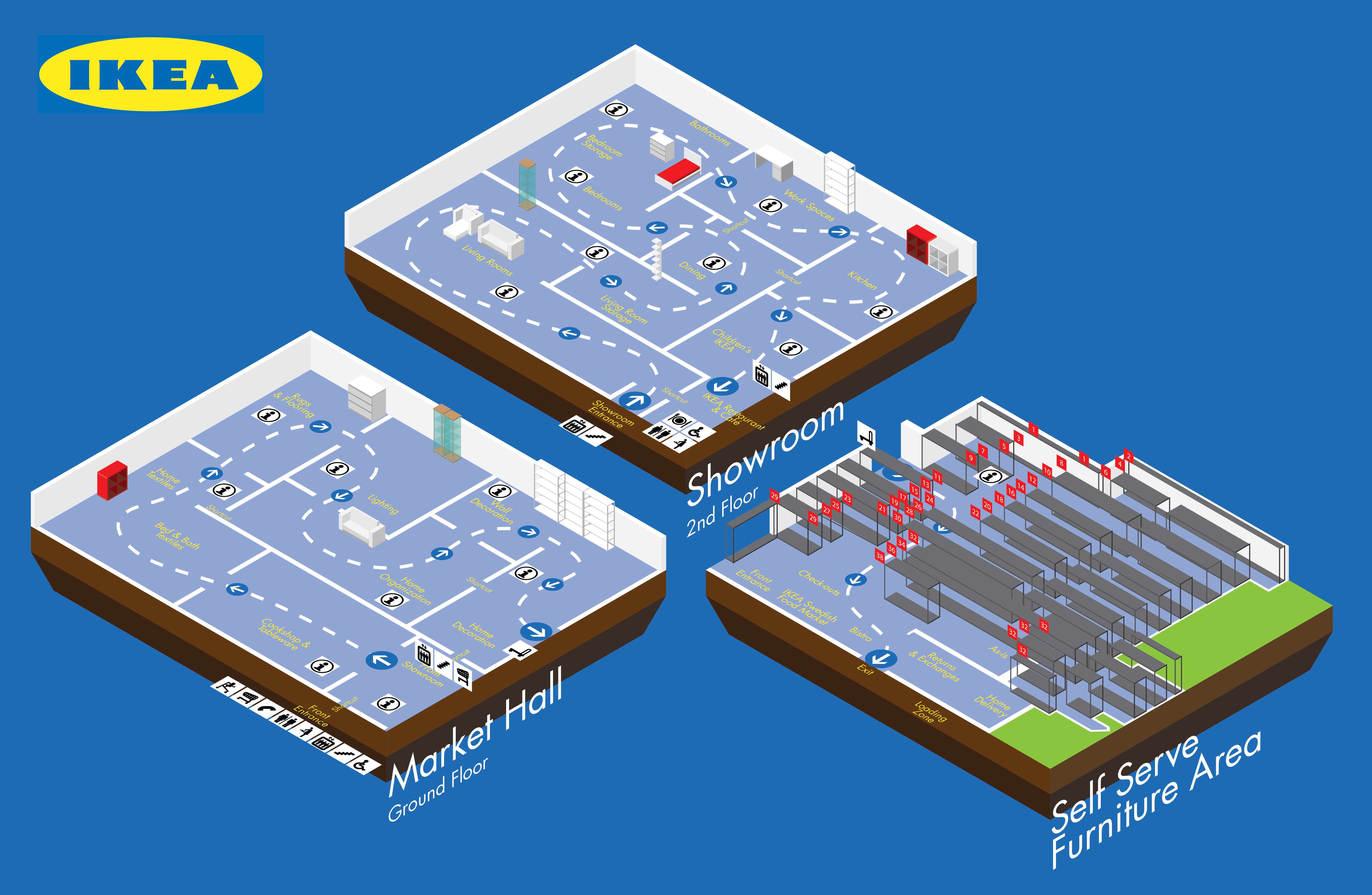
This project was meant to exercise Adobe Illustrator skills to create an isometric drawing of a process of our choosing. This particular process is of the different sections of Ikea.

Aspiring maverick designer, tweaking perfectionist, lover of all things art and creative, and shark enthusiast.
This project was meant to exercise Adobe Illustrator skills to create an isometric drawing of a process of our choosing. This particular process is of the different sections of Ikea.
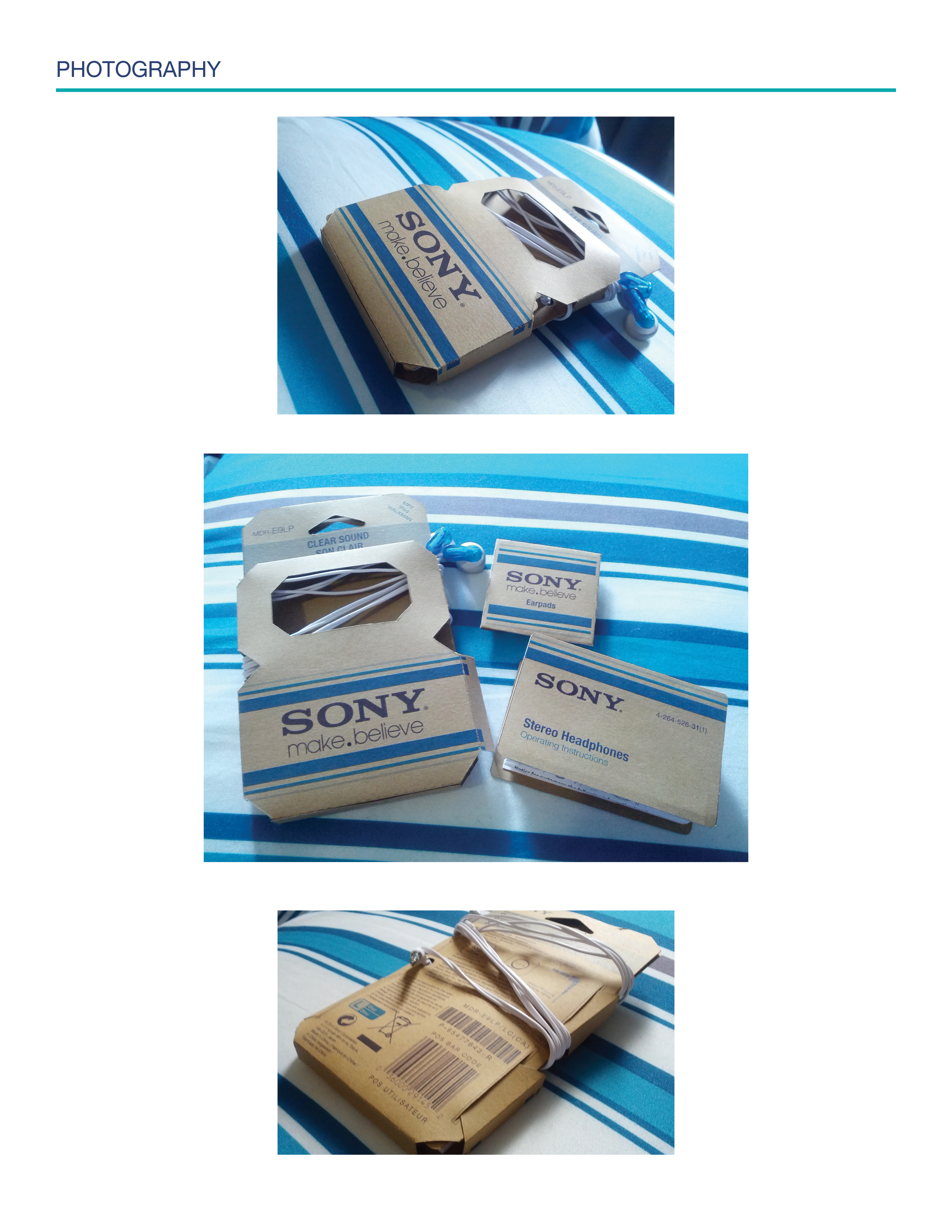
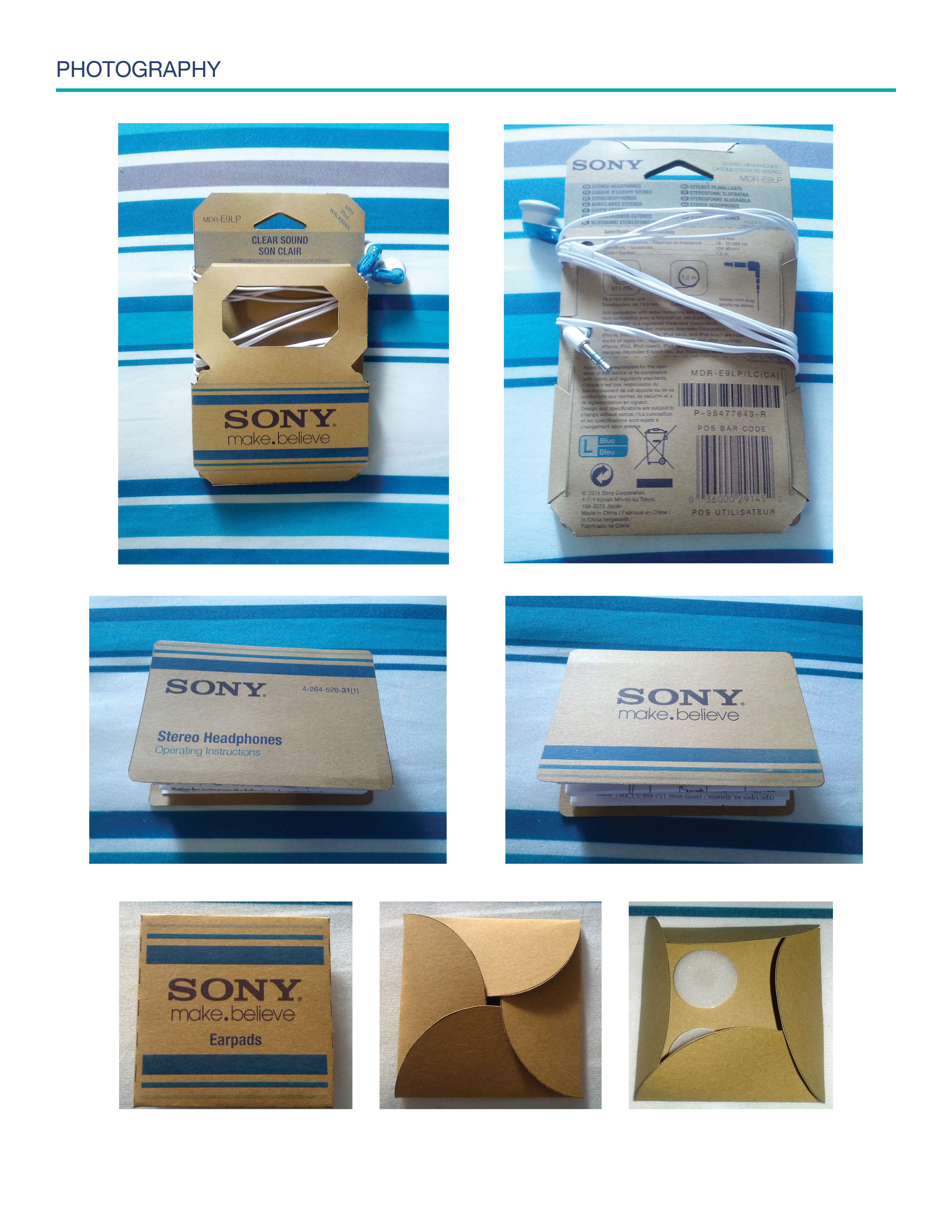
For this project we were tasked with redesigning a pre-existing product package design from the categories of toys, food, and electronics.
This is the design rationale.
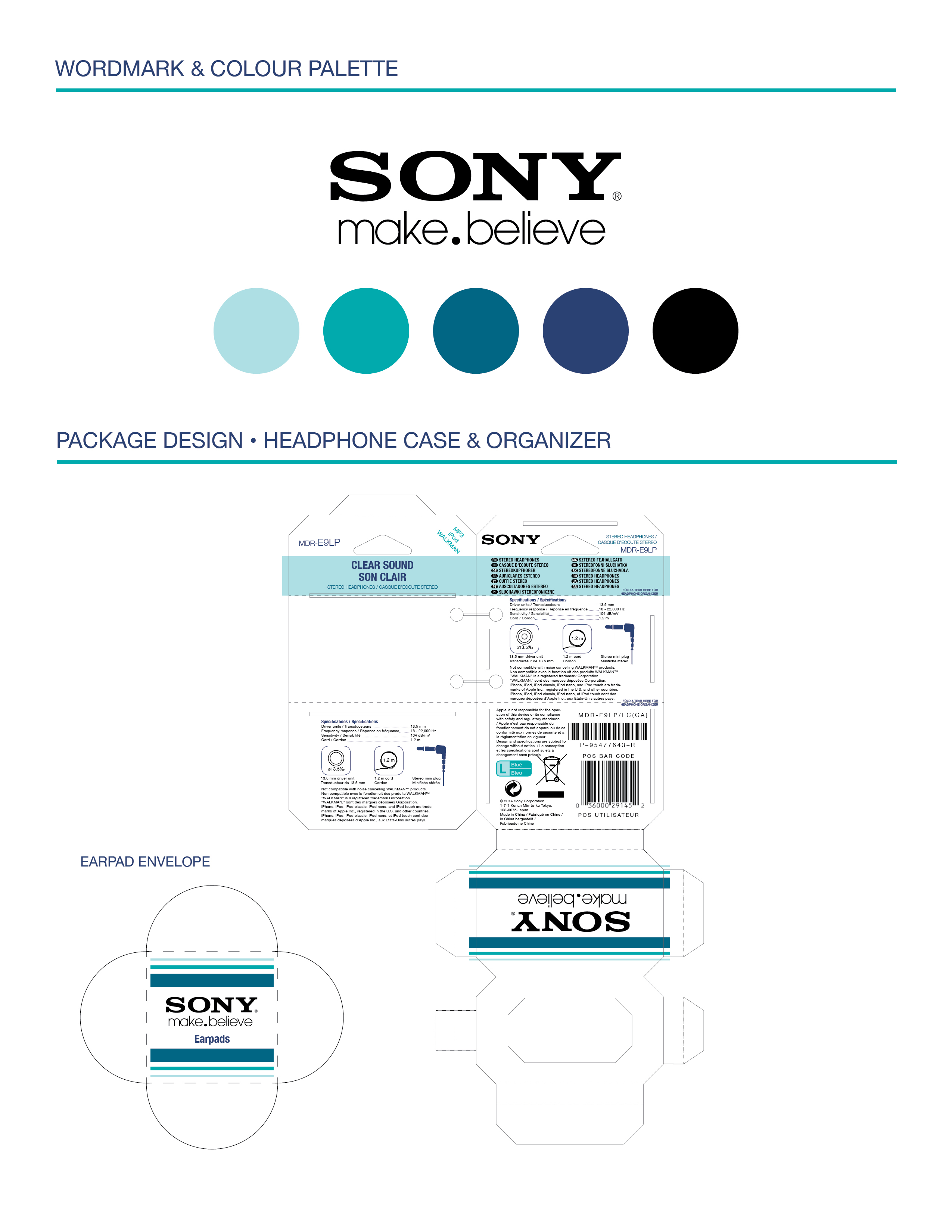
The colour palette and laid out package design.
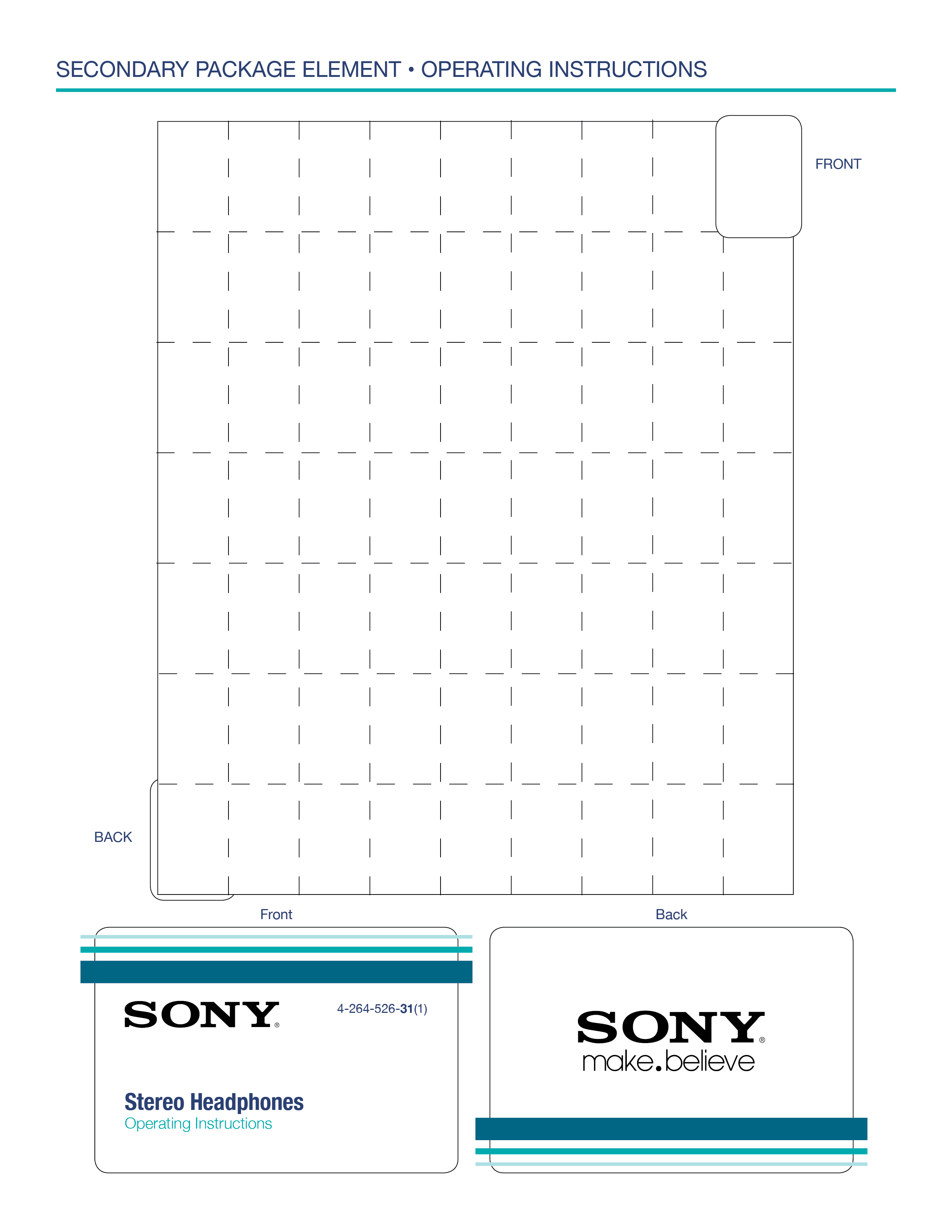
Layout and fold marks of easy-to-collapse manual.
For this project, we were tasked to study the style of Pablo Lobato and combine this with the Gestalt Principles. These principles include similarity, proximity, continuation, closure, and negative/positive space.
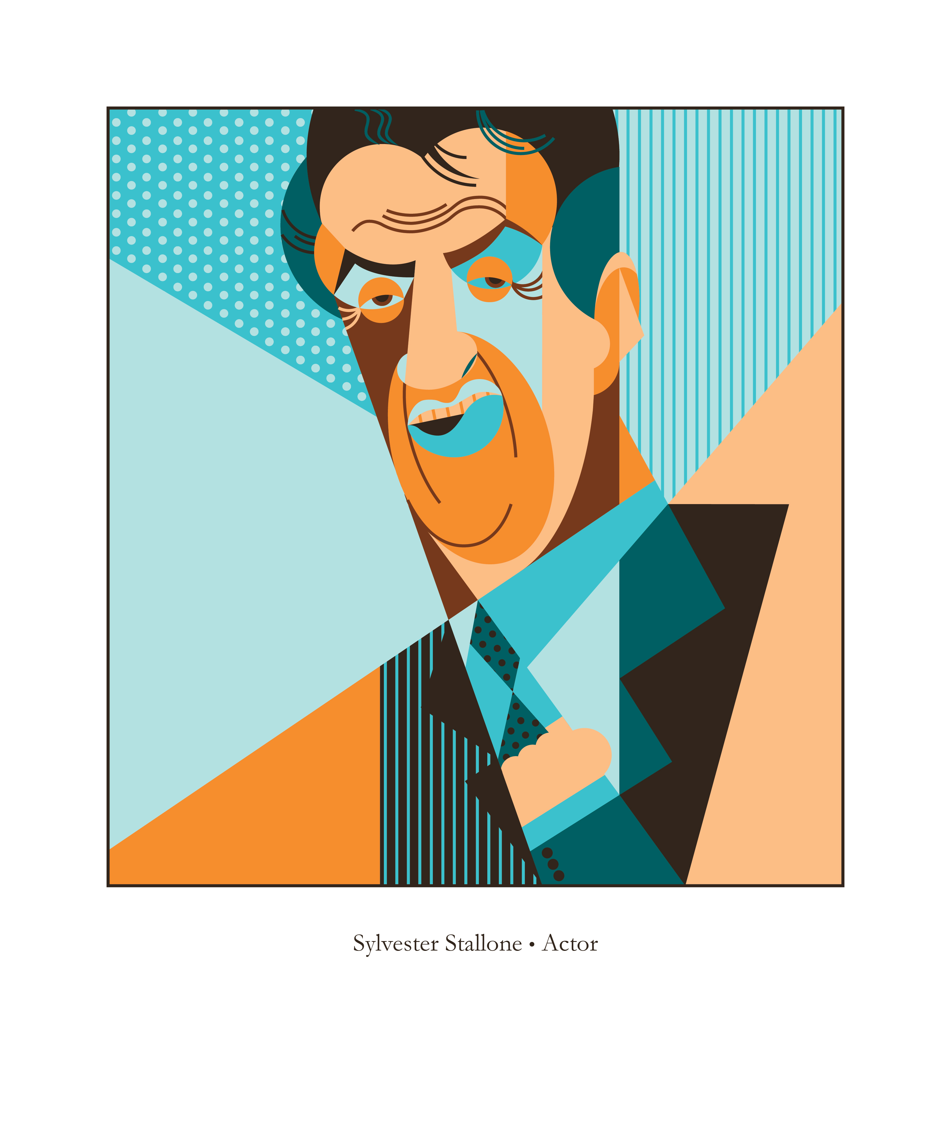
We were asked to choose a well-known accomplished individual whom wasn't already styled by Pablo Lobato. They could be an actor, scientist, singer, mathematician, reporter, writer, musician, etc.
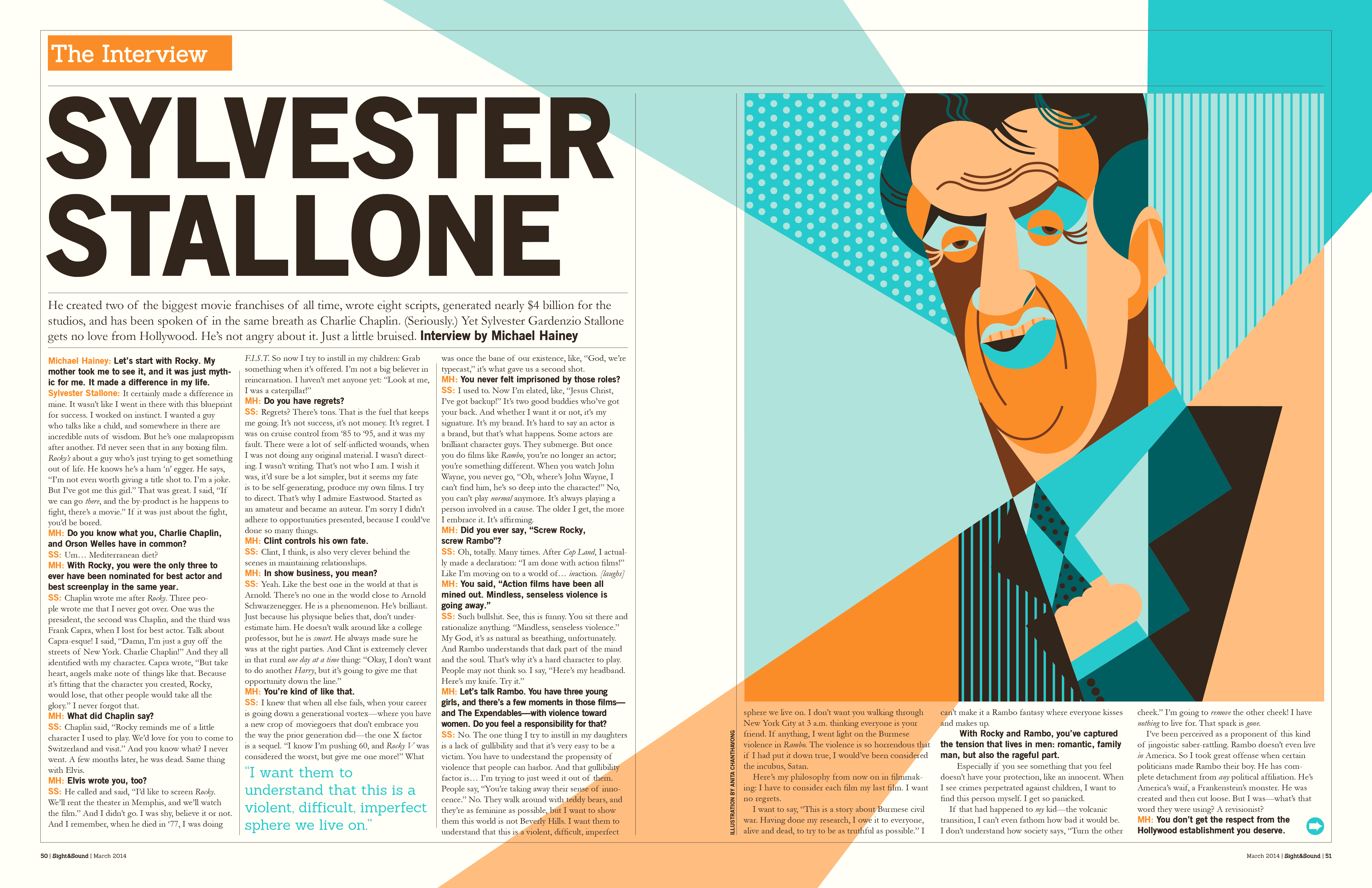
We were then tasked with implementing the finished illustration into a layout of our choosing that related to our subject. Possibilities included—but not limited to—a newspaper, magazine, CD cover, DVD cover, book cover, cosmetic packaging, and food packaging. We were required to research and find examples, as well as study and measure these pre-existing layouts for accuracy.
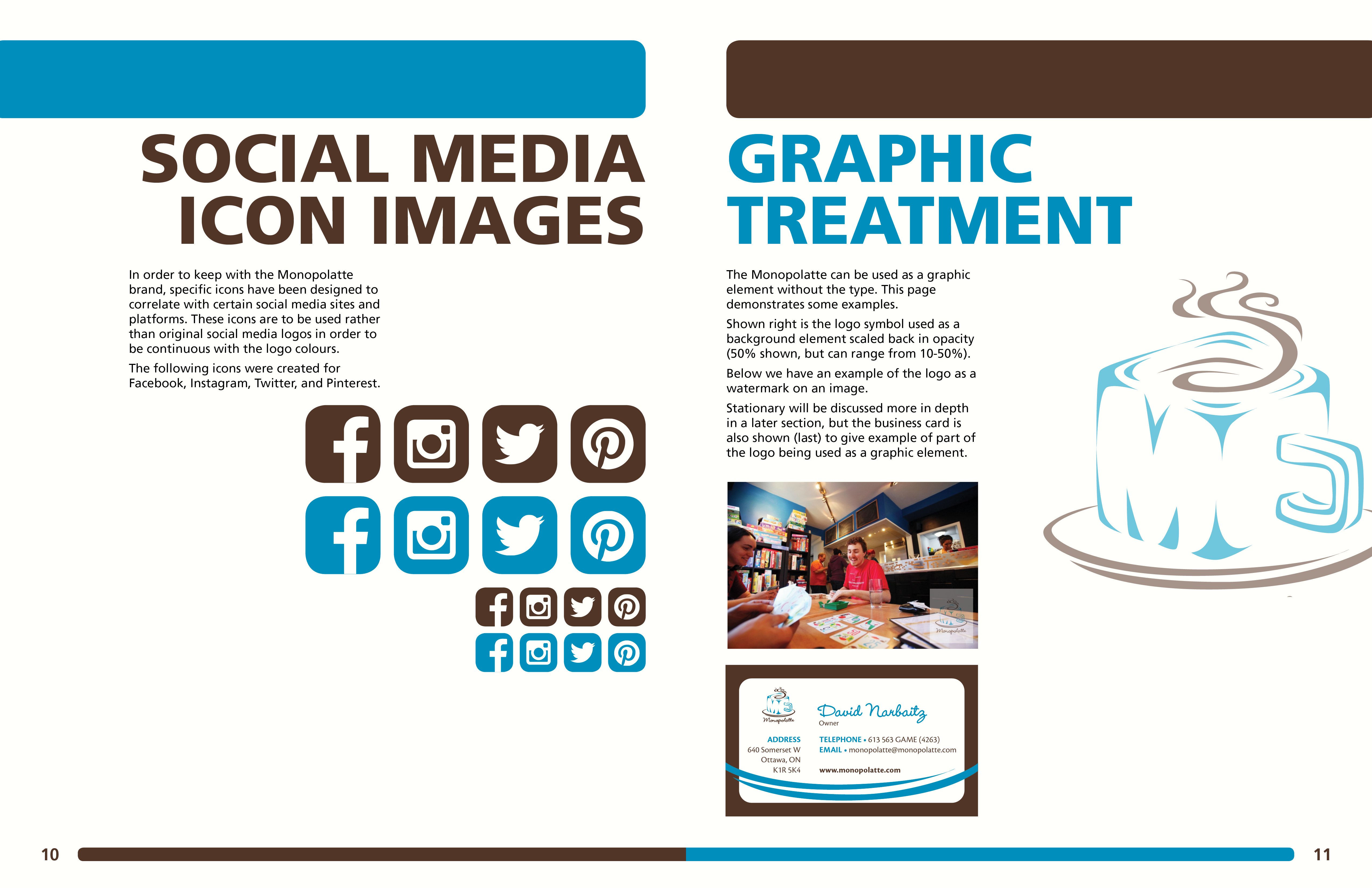
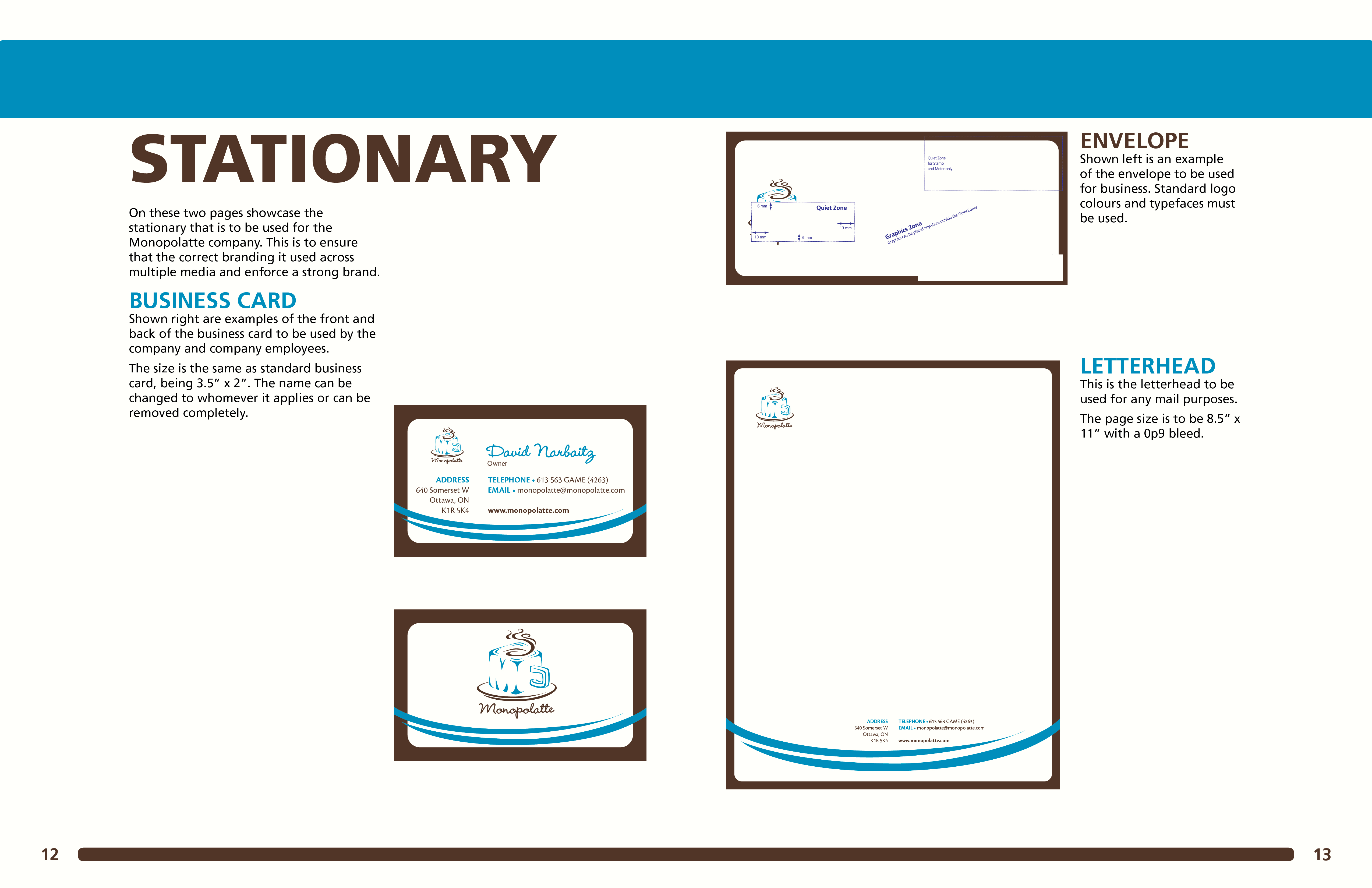
This was a semester-long project that required us to redesign a logo of a local business in Ottawa.
We were required to design a new logo, as well as create a branding guide to accompany the new design.
This is the inside cover.
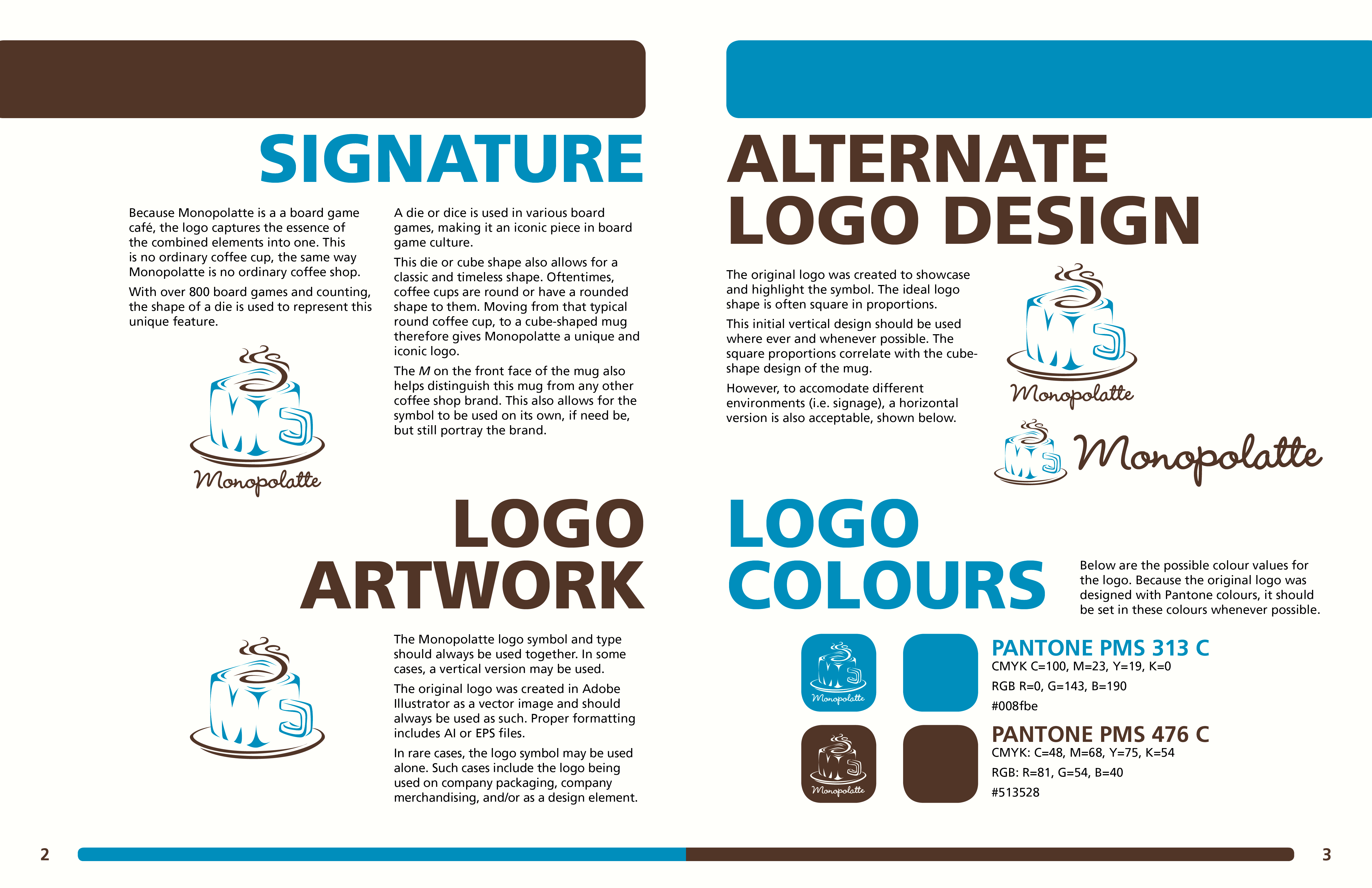
This spread outlines the brand's signature, logo artwork, alternate design, and logo colours.

This spread outlines the background colours that can be used and the values for proper contrast.
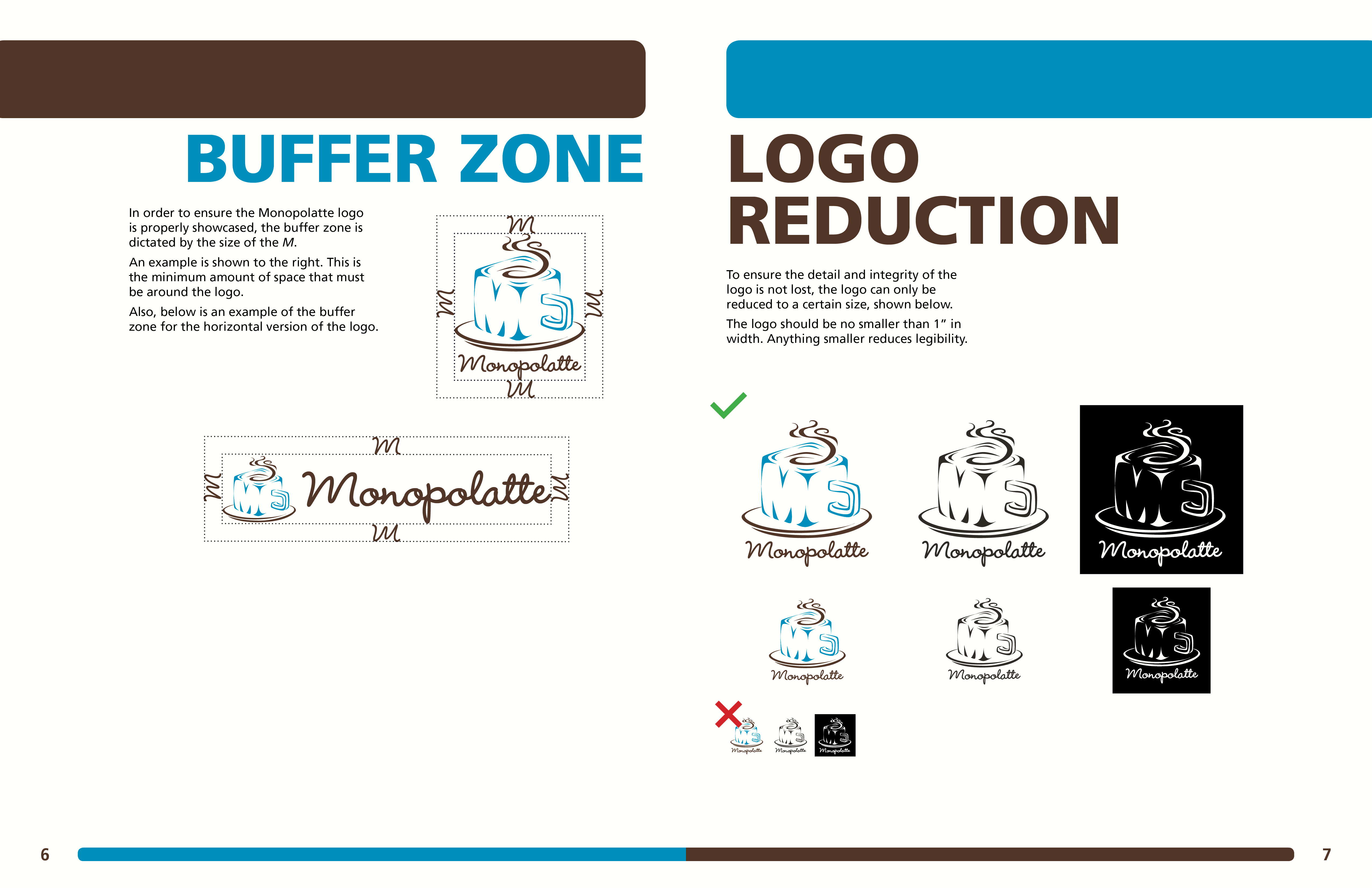
Here we have the guidelines for the buffer zone and reduction size.
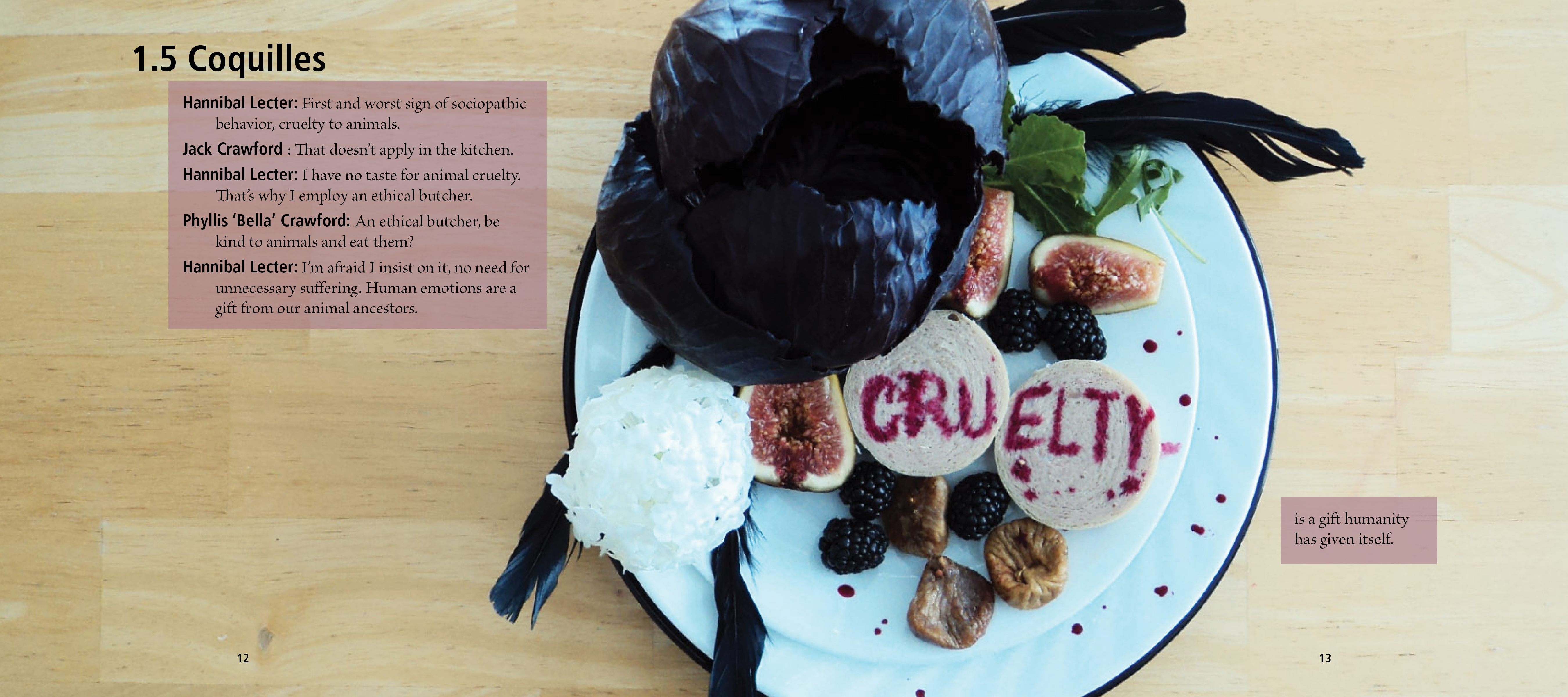
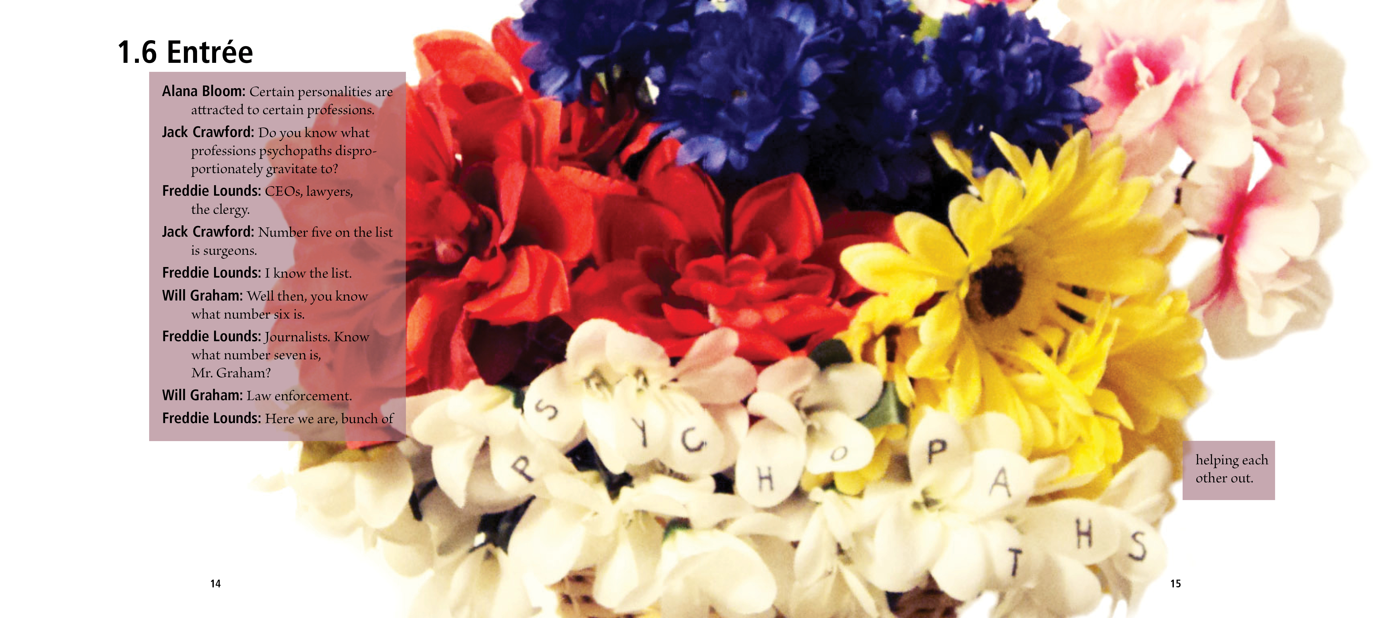
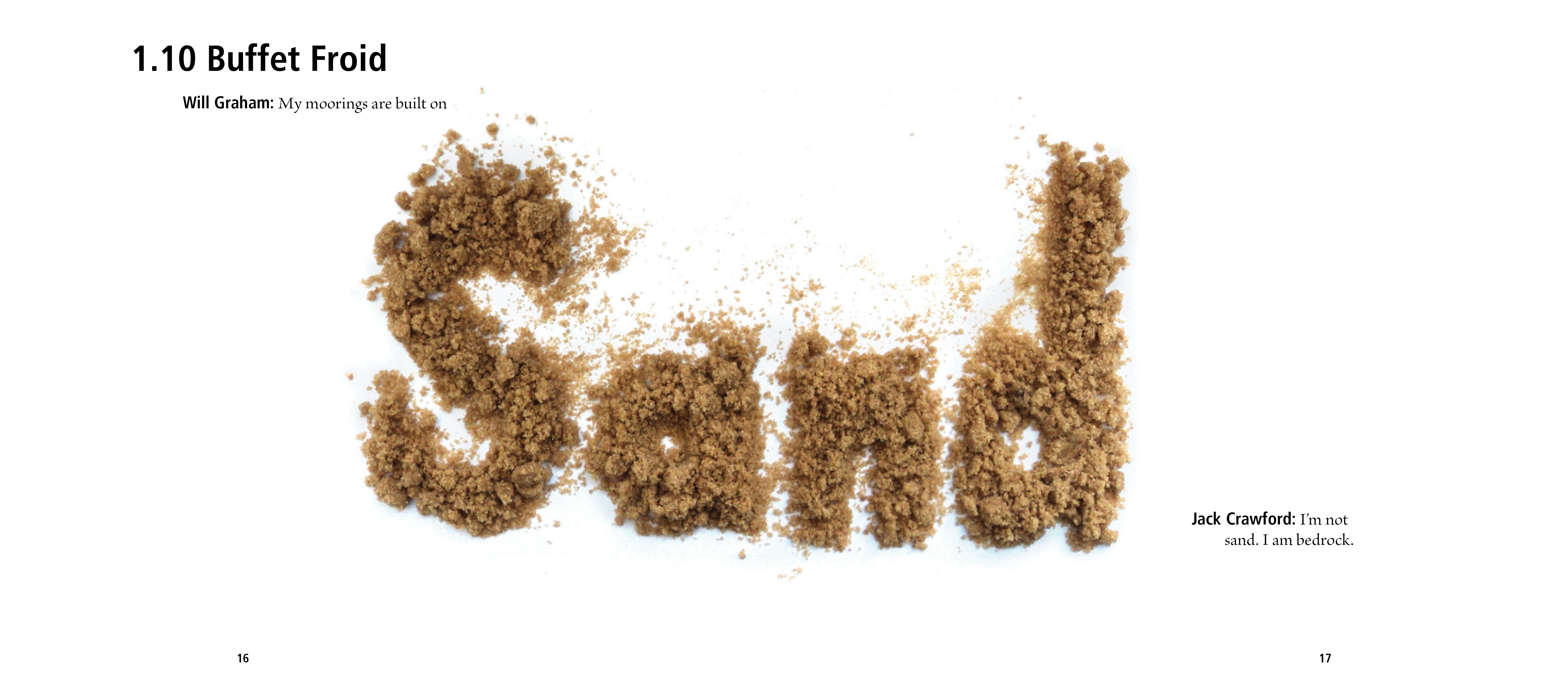
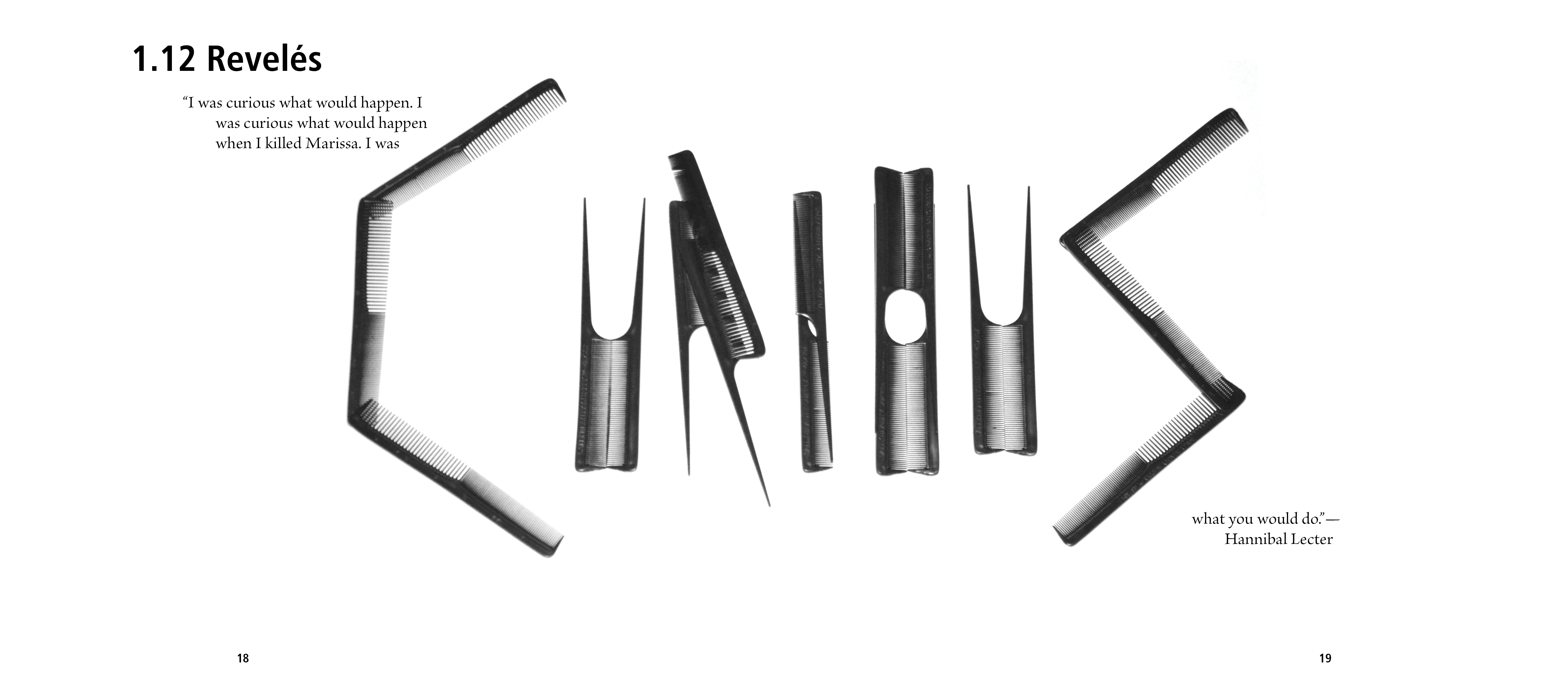
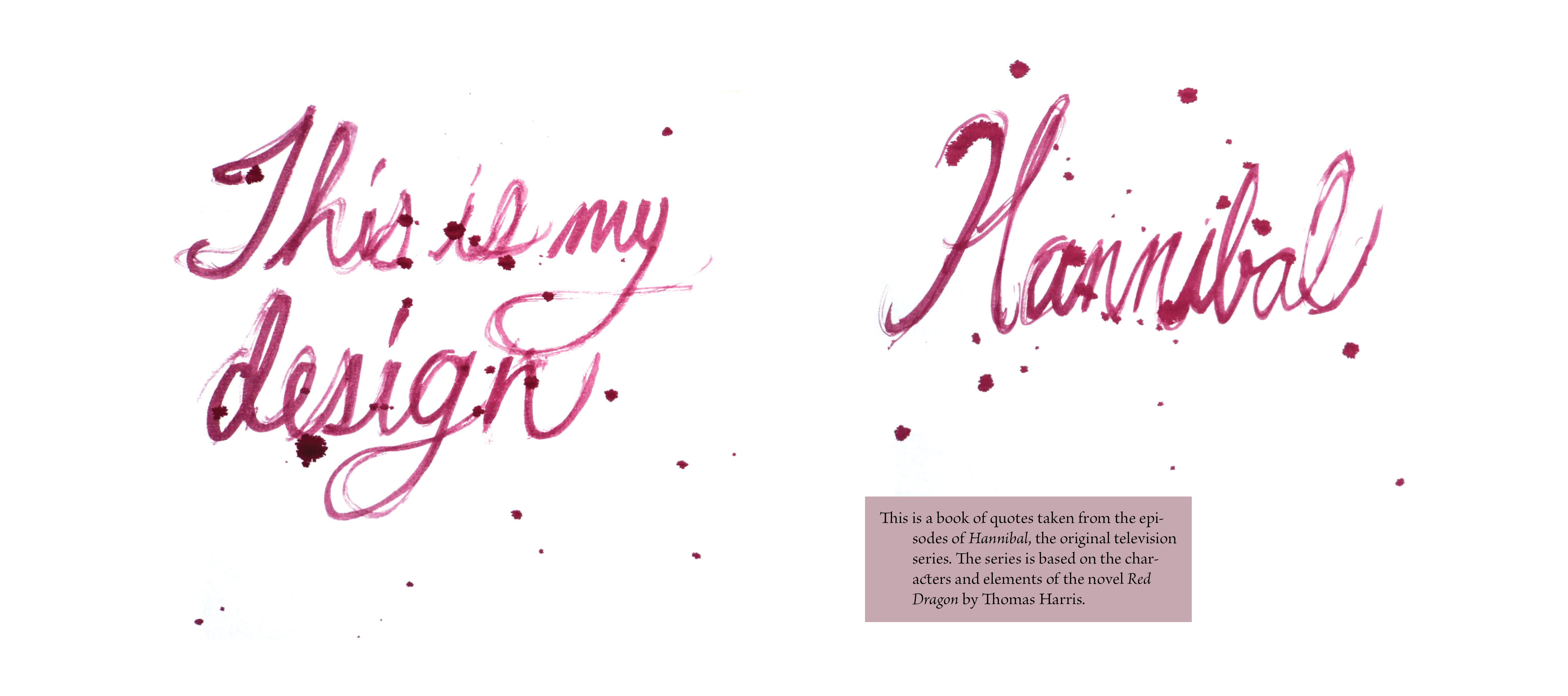
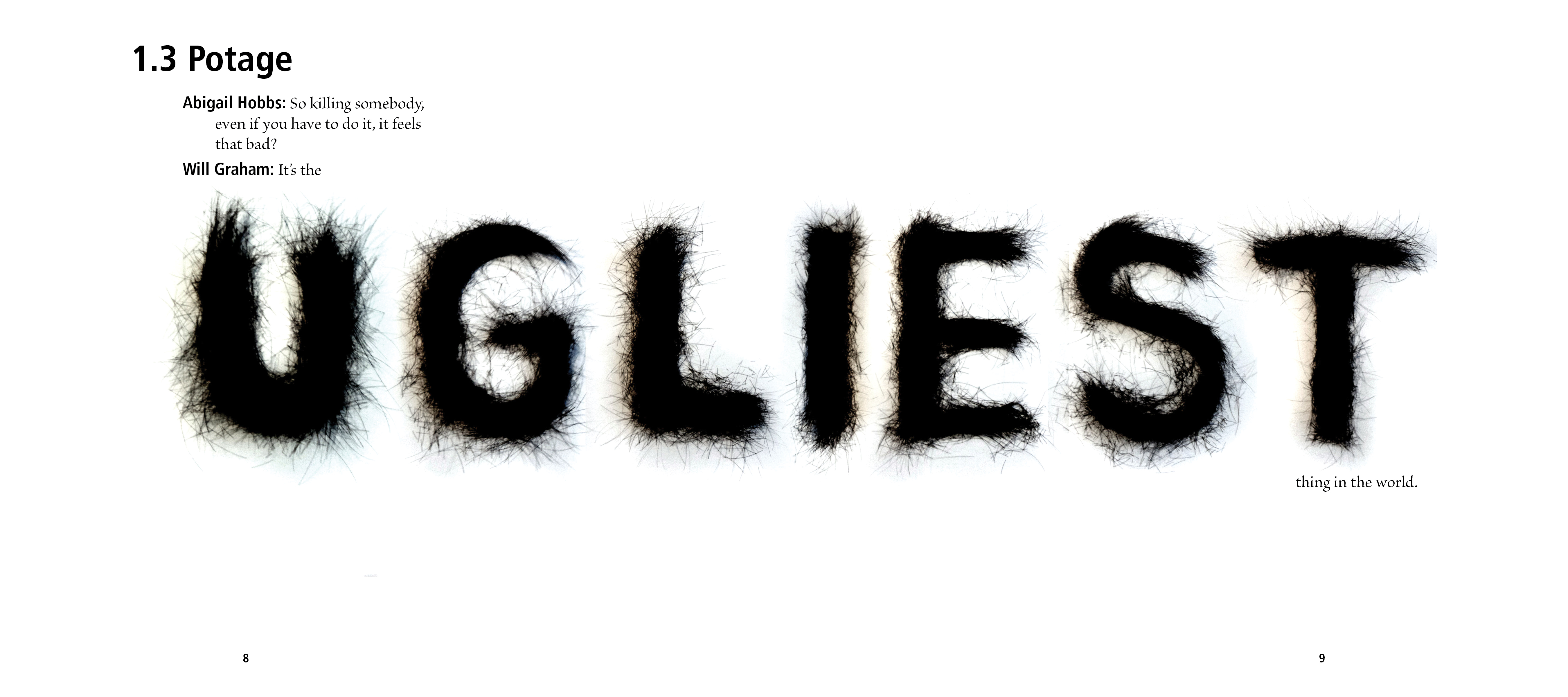
For this project, we were tasked with creating a quote book of a subject of our choosing to demonstrate our handmade and digital typographic skills.
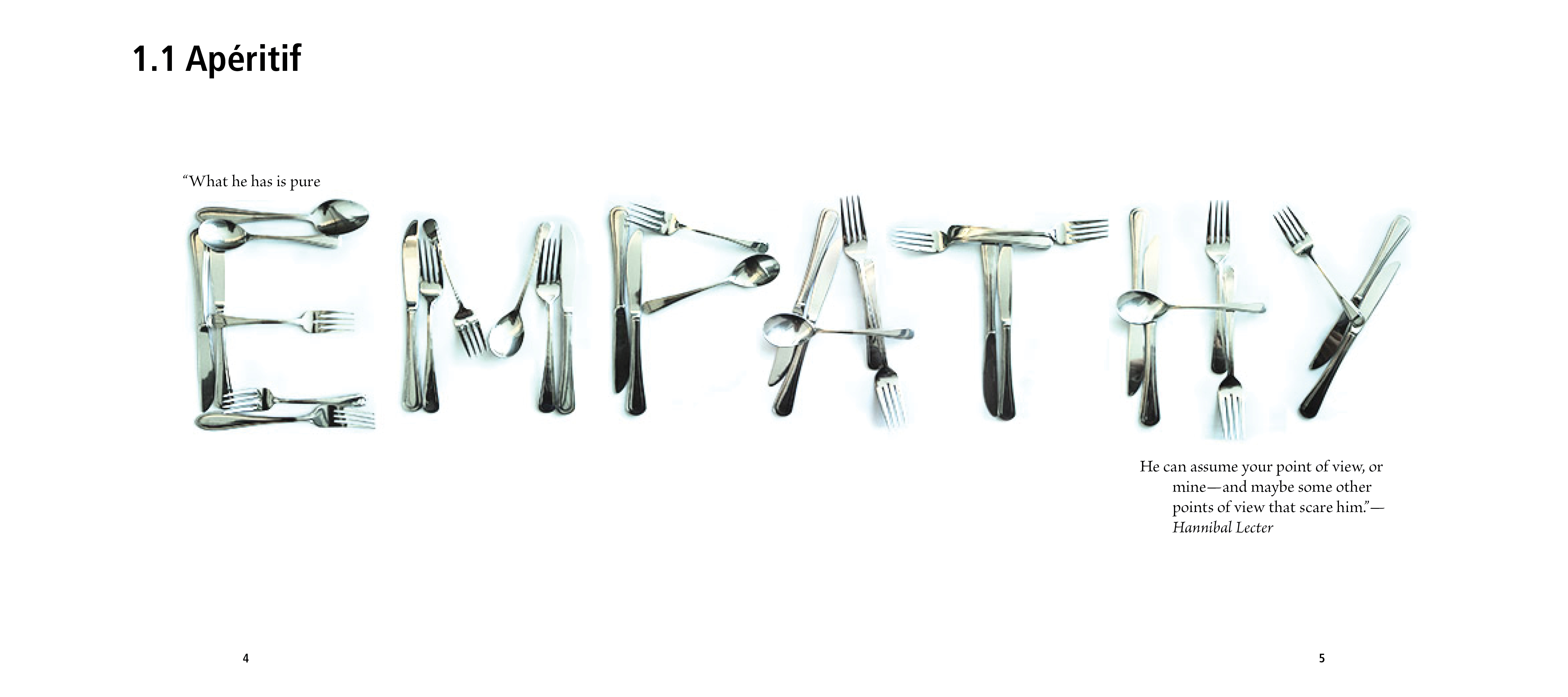
empathy
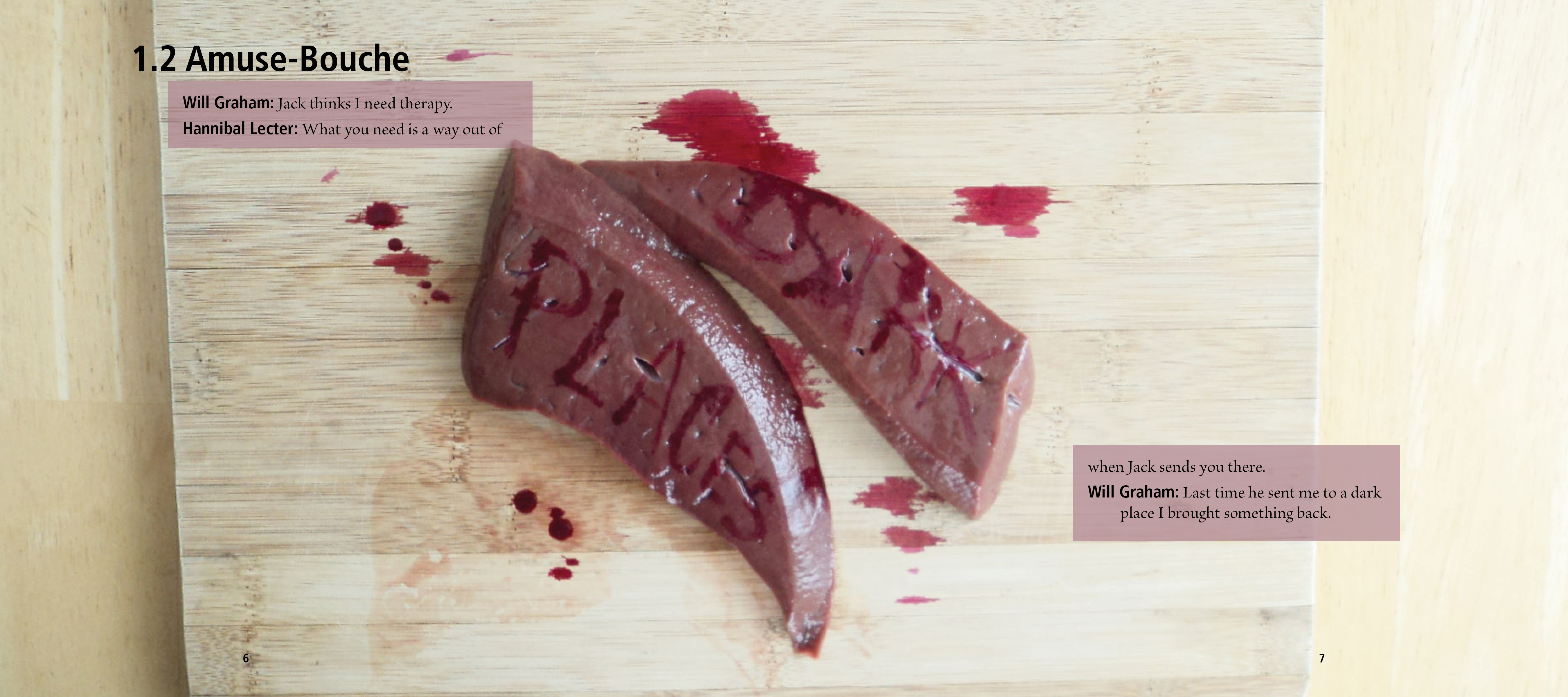
dark places
Have here whatever you like.
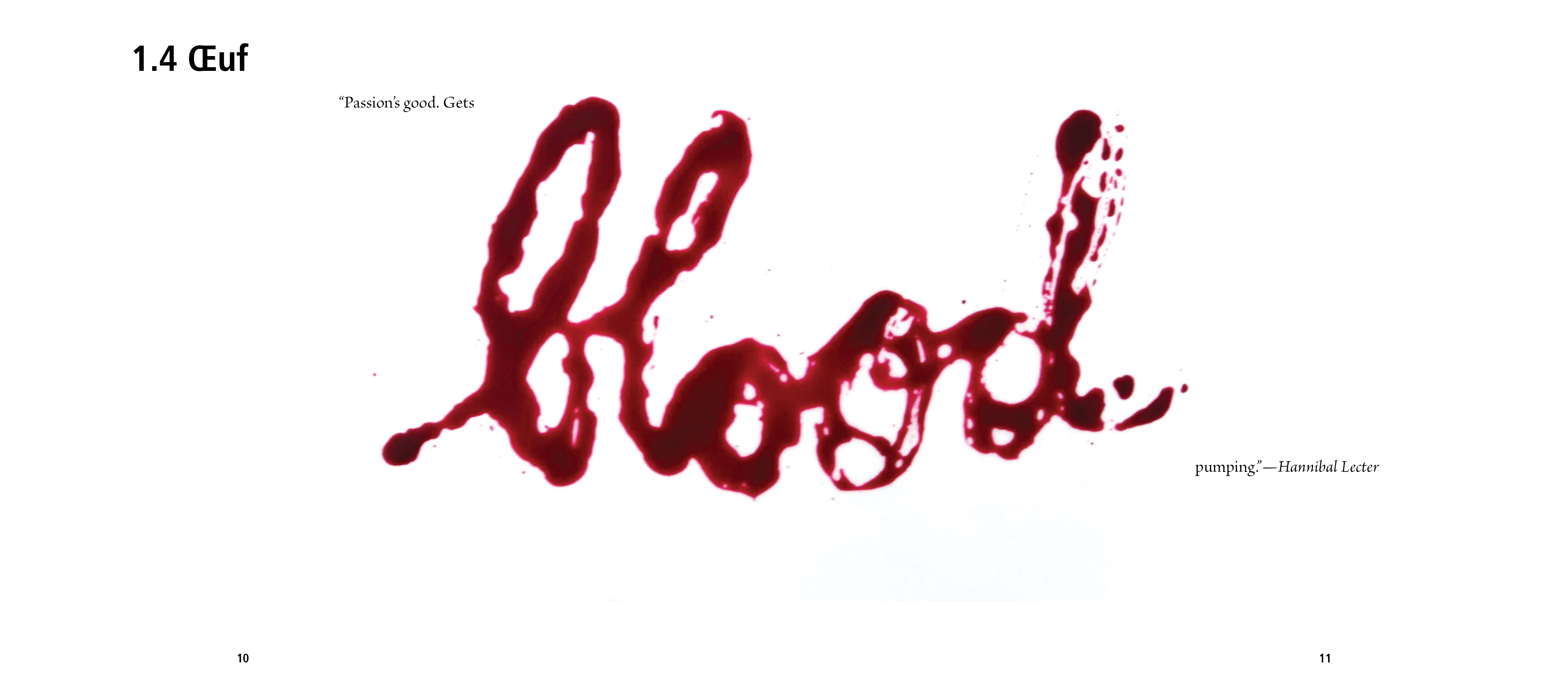
blood
Created with Adobe After Effects and Adobe Premiere Pro.